|
Visit TravelInBC.com, the home to all Quokka Systems Customers |
|
|
|
|
Where to Put it Pretend you could ask someone visiting your web site, "what is the most important piece of information about your web site?" What will they say? Location, Rooms, Rates, Amenities, Availability! Crucial information must be visible and easy to access. People are impatient, particularly those using computers. If it's not at the top, they are likely to zip past your site. As providers of an online booking system, we have noticed that new information on a web page tends to be put in rather odd locations. We would, naturally, argue that the availability information and ability to book is the most important, because without it, location, room configuration and activities are all irrelevant. No one is happy leaving a site saying, "gee honey it would have been nice to have stayed there." Being able to tell a site visitor what you do and don't have is important. Therefore it doesn't make any sense to hide the "book now" button. Because on many sites online booking comes after site design, web masters tend to drop the button in the site where it is convenient for them, not where it's best for the guest. All we ask is that you tell the person who maintains your web site to have all crucial information be on the first screen starting at the upper left-hand corner. |
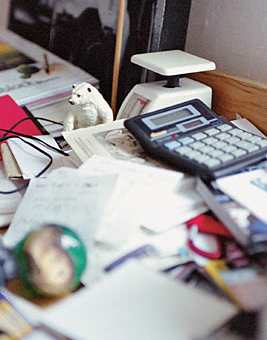
 Is your website is the electronic equivalent of a messy desk? | |